Radicalization at a Glance: Penn Media Accountability Project Launches Interactive Data Dashboard
As part of its Penn Media Accountability Project (PennMAP), the Computational Social Science Lab launches the first in a series of interactive data visualizations designed to make their research accessible and engaging.
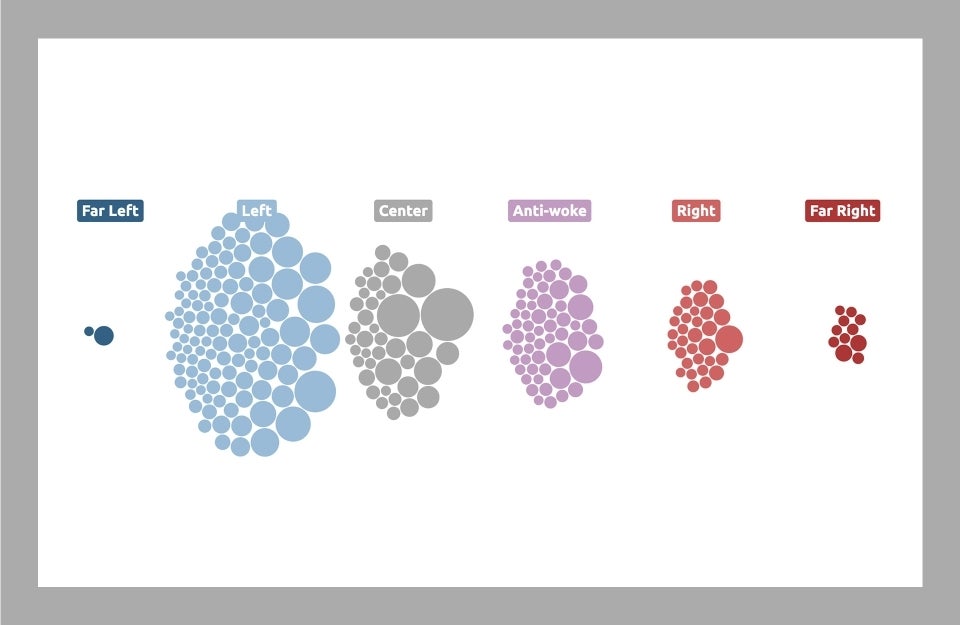
A graphic representation of the political leanings of the top 200 YouTube channels the lab monitored in its study. To learn more and experience it in interactive form, visit the YouTube Politics Dashboard.
A woman reads an article on a major news site claiming that YouTube’s video recommendation algorithm — autoplay, suggested content, and the like — drove a viewer from harmless cat videos to far-right conspiracy theories. She wants to know if her teenage son, who spends hours on the platform every day, could fall prey to such radicalization. What does she believe? Where should she go for more information? Does she dare ask Google for answers?
High-profile, plausibly apocryphal anecdotal accounts of online radicalization may make for eye-catching headlines, but they rarely tell the whole story. What really happens behind the scenes of the media ecosystem is a frustrating web of algorithms, user preferences, and content choices, factors which Penn Integrates Knowledge professor Duncan Watts and other researchers at the University of Pennsylvania’s Computational Social Science Lab (CSSLab) have been grappling with for years.

In a partnership with Analytics at Wharton, the CSSLab launched the Penn Media Accountability Project, or PennMAP, with a mission to assess the health of the information ecosystem and how it affects public opinion, political polarization, and, ultimately, democratic decision making. In an era when everyday media seems more politically charged than ever, that’s a full-time job. Using several terabytes’ worth of data documenting production, distribution, and consumption of news across television, radio, social media, and the broader web, the PennMAP team tackles phenomena from radical content to outright misinformation to more slippery “half-truths” — biased reporting, tactful omissions, misleading headlines, and more — on a massive scale.
Now, the Lab is making moves on a second important facet of PennMAP’s mission: transforming their findings into publicly accessible and useful online tools. Taken together, these dashboards will form the basis of a larger hub for PennMAP’s core outputs, a collection the Lab’s researchers are dubbing the Living Journal.
Creating a “Living” Journal
The motivation behind the Living Journal can be summed up in three core goals:
Impact through accessibility
In 2023, the PennMAP team is prioritizing real-world impact by expanding their work’s reach beyond the academic community. Their goal is to turn their publications and colossal collection of underlying data — encompassing news articles, social media posts, and individual-level viewing data across the TV and web — into engaging, interactive, and entirely public Living Journal dashboards that allow users to absorb key insights quickly.
David Rothschild, a CSSLab affiliate from Microsoft Research, is helping to spearhead the Living Journal as PennMAP’s avenue for accessibility. “From the beginning of our collaborations,” Rothschild notes, “Duncan and I have embraced blogs, general public-facing quasi-academic publications, conferences, and Twitter, among other ways, to get our research out faster and to a variety of stakeholders.” He emphasizes that while there is a vast second audience across government, industry, and the public that is interested in PennMAP’s work, these groups are difficult to inform or impact using traditional journal articles alone; beyond the paywalls and login screens that make much research off-limits to the average American, the time, attention, and domain expertise needed to parse such publications can put them even further out of reach.
By packaging PennMAP’s data and findings in more easily accessible formats, Rothschild, Watts, and the rest of the team aim to create a better informed community of everyday media consumers. Moreover, they hope that the Living Journal will pave the way for collaborations with various stakeholders — including journalists, policy makers, and industry partners — to implement media solutions.
Moving beyond the PDF
The PennMAP team believes it is high time to diversify the key academic metric: the static journal article. To this end, they see the Living Journal as an attempt to set the standard for a new approach that merges research outputs and scientific communication.
“Academics’ research is mainly judged on their academic journal publications,” Rothschild explains, “and there is merit to that system — there is a peer-review process that can improve and check the quality of work, and a citation system that allows the market to reward articles of interest and impact. But, the academic journal system has a lot of flaws when it comes to getting relevant and timely research to the right stakeholders.”
On top of reaping the benefits of innovating within the research process, the Living Journal model will open new opportunities for collaboration across industry and academia. Rothschild and Watts hope to grow the platform into a functional research hub for the field at large, where researchers from around the world will be able to contribute their data, findings, and visualizations to create a more comprehensive analysis of the media landscape. In this way, findings that would otherwise be constrained to a single PDF document come alive, and can interact and forge connections with other research and datasets within the Living Journal.
Robustness over time
While publishing academic research articles can help communicate timely results, such works typically do not have much of a shelf life: “they are static documents,” says Rothschild. “We want our research to stay relevant by updating over time and allowing interested stakeholders to explore dimensions we may not have included in a few static charts and tables.”
Having access to consistently updating — or even real-time — data visualizations can help to challenge underlying assumptions about how major processes and trends in the media evolve. In addition to giving users a better picture of the state of the media landscape according to the most up-to-date data, dashboards that change over time serve as a robustness check for researchers’ findings. By reflecting the impacts of current events, they provide a window into how new developments in the media may affect their initial conclusions.
The First Step: The YouTube Politics Dashboard
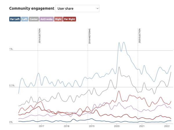
Paving the way for the Living Journal, the CSSLab has launched the first installment of their interactive dashboard series. The YouTube Politics Dashboard presents key data and findings from the Lab’s investigation into YouTube radicalization, led by Associate Research Scientist Homa Hosseinmardi. In their 2021 paper, Hosseinmardi and others on the PennMAP team — including Watts, Rothschild, and affiliate researcher Amir Ghasemian — examine the types and distribution of political content consumed across the YouTube platform and by average users. They assess the various pathways viewers use to reach political content, along with how they consume similar content across the web, to determine whether the platform’s recommendation algorithm has a hand in radicalizing viewers.
Breathing new life into their work, the YouTube Politics Dashboard presents the CSSLab’s data from a panel of more than 300,000 Americans and their individual-level browsing behavior, on and off YouTube, from 2016 to 2021. This is supplemented with transcripts and meta data from nearly a thousand YouTube channels, totalling over half a million unique videos. In addition to exploring the major claims and figures in the original research paper, users can explore fresh visualizations and data, including a deep dive of the top 200 YouTube channels used in the dataset.
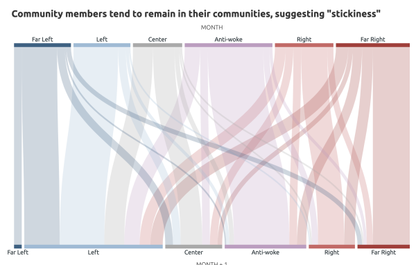
Presented in this way, the dashboard has a major effect on the way one can visualize online political communities. It makes clear that, rather than being static groups of politically siloed users, these communities are continuously shifting. Moreover, it provides insight into whether users are radicalized by the algorithm, or whether their YouTube viewing preferences simply align with the types of content they consume elsewhere on the web. YouTube is arguably the largest and most engaging online media platform in the world — with stakes that high, the Lab’s insights take on added weight.
The Future of the Living Journal
In addition to YouTube Politics, the Lab is developing a second dashboard currently on track for a spring 2023 launch. The forthcoming dashboard builds off PennMAP’s works on partisan news diets and fake news published in Science Advances, presenting their long-term data on TV and web consumption. Through a series of novel visualizations, it will provide insight into what a typical cross-media news diet looks like, along with how politically siloed average American viewers are.
Miguel Rivera-Lanas, Data Scientist at the CSSLab, offers a glimpse into the development process: “I’m working with our researchers to extend the observation period of the original paper, so we’re able to re analyze the the conclusions on an ongoing basis,” he explains. “We’re drawing from Nielsen Desktop and TV Panels, which contain detailed records of individual level desktop browser and TV viewership activity between 2016 and 2022. The aim, broadly, is to describe how the average distribution of U.S. consumption patterns have changed over time, and focus on tendencies for sub-populations to strictly narrow their consumption to what we understand as politically partisan content.”
Taken together, these dashboards reflect the larger vision for PennMAP and its Living Journal, which the CSSLab is excited to unfold in 2023. By forging new pathways to core research content for broad audiences, the team hopes to create more informed citizens, more responsible journalists, and practitioners who can more easily act on the Lab’s data and use it to make informed policy decisions.
“We do not want to get bogged down in doing everything at once,” Rothschild adds, “but we are optimistic that the work we have done over the last few months will make a strong impression over what we are putting together. We hope that our Living Journal will quickly become a regular location for researchers to explore, but also for journalists and other practitioners who want to learn more about the research around information production, distribution, consumption, absorption, and impact.”
Explore the YouTube Politics Dashboard
Read the Research: "Examining the Content of Radical Content on YouTube," PNAS